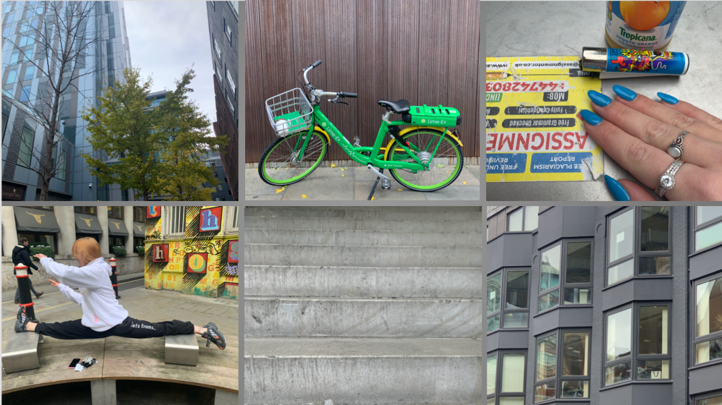
I have chosen the word “Balance“. Its meaning is ‘a state where things are of equal weight or force'(Cambridge University Press 2019). I associate this mood board with balance and it is, in fact, perceivable in the colour palette (between a neutral grey and bright blue, red, yellow and green). The colour ‘grey is a cool, neutral, and balanced colour’ (Bourn 2010). For instance, the first picture represents a naked tree and a fully leafed tree aside. I also wanted to represent the balance as literally as possible; using a picture of a two-wheeled bike, a picture of my groupmate balancing in a split and pictures of perfectly symmetrical stairs or windows.
I’ve learned from this exercise how to build a mood board and the difficulty of doing it from non-secondary resources.
